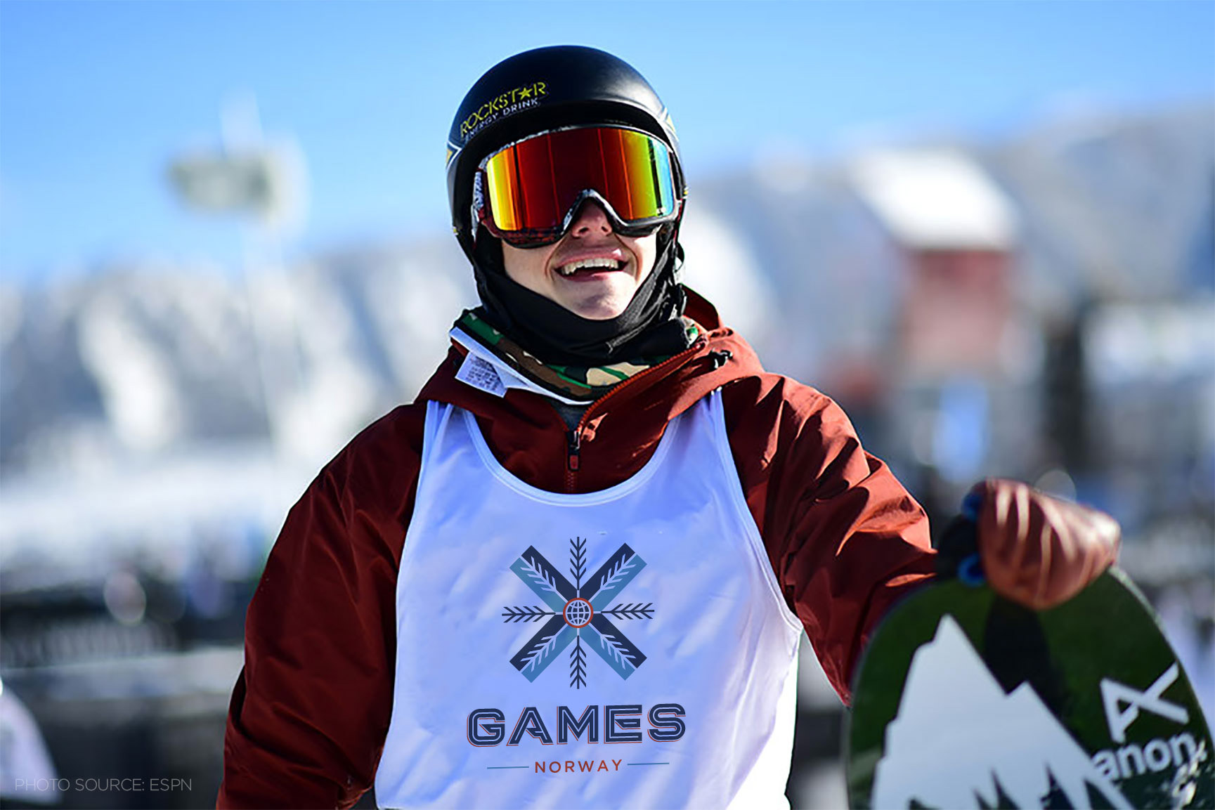
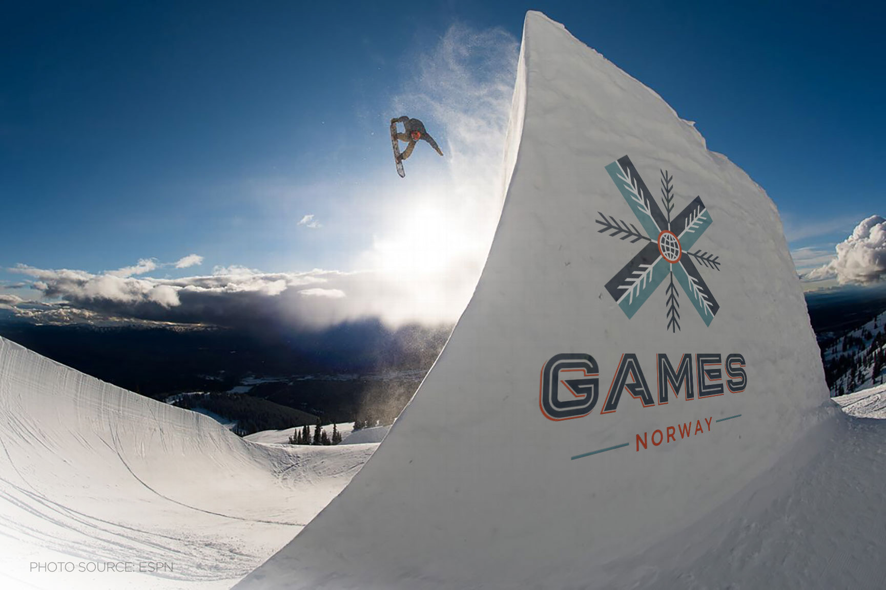
Rebrand
The winter X Games represents a wide variety of sporting events and athletes. When designing the logo, it was essential to create something that is bold and would stand out, just like the athletes that compete in the X Games. We started with the current X Games logo and modified it to create something new and fresh. We changed the width of the strokes, and the inlines, to create a more streamlined look. We then added the snowflake branches on the inside of the “X” as well as on the outside to help connect it to the winter season. The primary typeface is bold and matches the same aesthetic as the logo.

Wayfinding System
Designing the wayfinding system was an interesting balance between functionality and style. In the final piece, we achieved this by highlighting the elements essential to the viewer while using the new winter X Games branding to keep a consistent feel. For the macro map, we emphasized the main route to help guide the viewer, while still including additional roads to help orient the viewer. For the micro map, we created an isometric view to give the viewer a better sense of the area, to help better navigate the event site. The goal for the maps was to help the user get a sense of their surroundings, while also finding their way.